Shortcodes
Accordion
Blockquotes
Lorem ipsum dolor sit amet, consectetur adipiscing elit. Integer posuere erat a ante.
Quote's author in Source Title
Lorem ipsum dolor sit amet, consectetur adipiscing elit. Integer posuere erat a ante.
Quote's author in Source Title
Tags
Core Typography
h1. Heading Secondary text
h2. Heading Secondary text
h3. Heading Secondary text
h4. Heading Secondary text
h5. Heading Secondary text
h6. Heading Secondary text
TIPS: Create lighter, secondary text in any heading with a generic <small> tag or the .small class.
Example body text
This is a lead paragraph.
Make a paragraph stand out by adding .lead.
Maecenas sed diam eget risus varius blandit sit amet non magna. Donec id elit non mi porta gravida at eget metus.
Nullam quis risus eget urna mollis ornare vel eu leo. Cum sociis natoque penatibus et magnis dis parturient montes, nascetur ridiculus mus. Nullam id dolor id nibh ultricies vehicula.
The following snippet of text is rendered as bold text.
The following snippet of text is rendered as italicized text.
An abbreviation of the word attribute is attr.
Address
Company Name795 Folsom Ave, Suite 600
San Francisco, CA 94107
P: (123) 456-7890Full Name
P: (123) 456-7890
This email address is being protected from spambots. You need JavaScript enabled to view it.
Emphasis classes
This is a .mute paragraph.
This is a .text-primary paragraph.
This is a .text-warning paragraph.
This is a .text-danger paragraph.
This is a .text-success paragraph.
This is a .text-info paragraph.
Alignment classes
This is a left aligned text .text-left
This is a center aligned text .text-center
This is a right aligned text .text-right
This is a justify aligned text which is often used in Book Design, Magazine or special Typo Pages. Create a justify aligned text with .text-justify class.
Brand Colors
- #1d9bdc
- Brand Primary
- #fe6945
- Brand Secondary
- #f0ad4e
- Brand Warning
- #fbe57c
- Brand Danger
- #5bc0de
- Brand Info
- #4db18d
- Brand Success
Grayscale Levels
- #26292d
- Gray Darker
- #4c5560
- Gray Dark
- #555555
- Gray
- #8c959f
- Gray Light
- #eee
- Gray Lighter
- #f7f7f7
- Gray Lightest
Inputs
Alerts and Notifications
Badges
Labels
List groups
- 14 Cras justo odio
- 2 Dapibus ac facilisis in
- Morbi leo risus
- 1 Morbi leo risus
- 2 Dapibus ac facilisis in
List group item heading
Donec id elit non mi porta gravida at eget metus risus varius blandit.
List group item heading
Donec id elit non mi porta gravida at eget metus.
List group item heading
Donec id elit non mi porta gravida at eget metus.
Panels
Panel primary
Panel success
Panel warning
Panel danger
Panel info
Wells
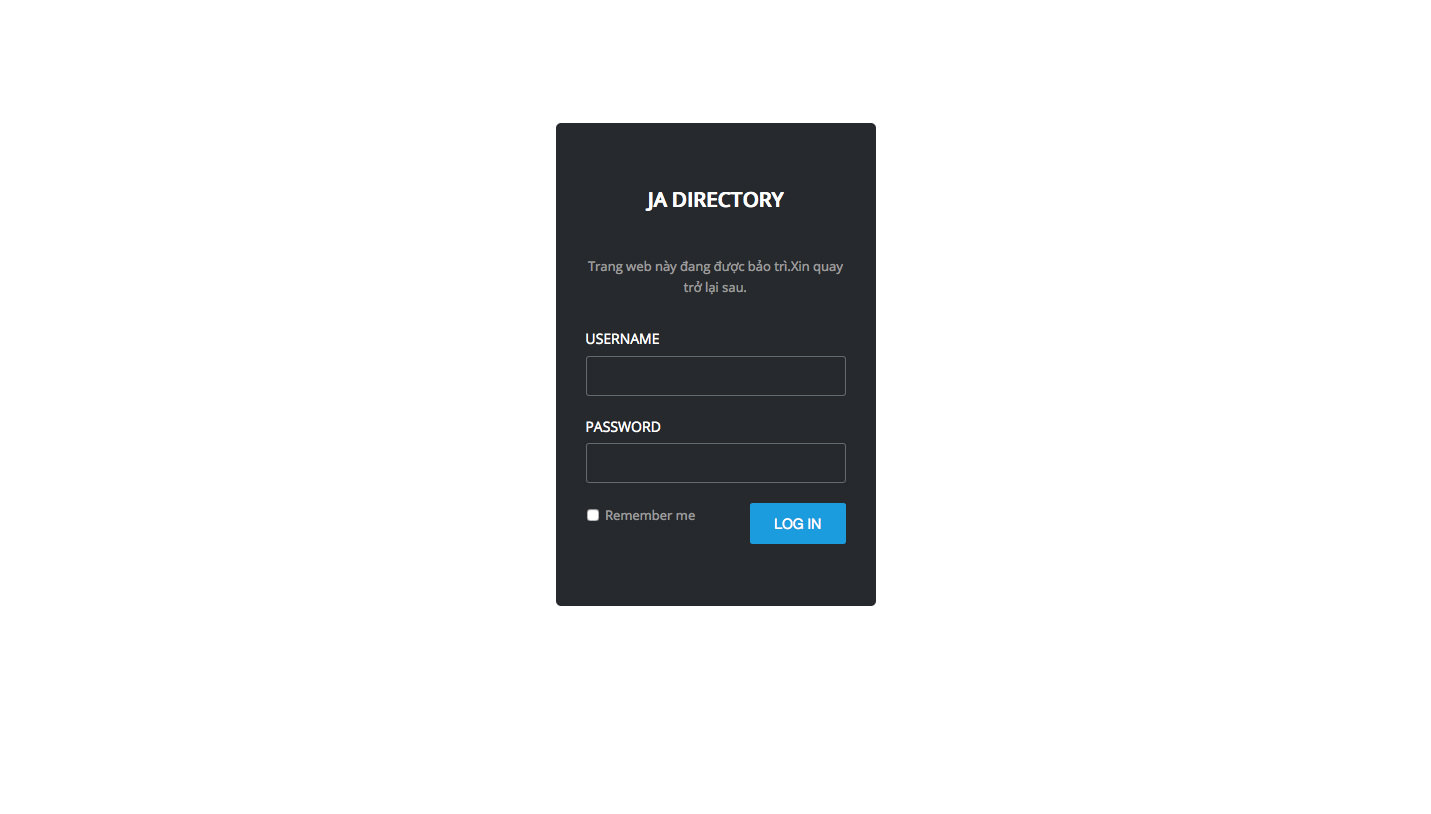
Offline Page
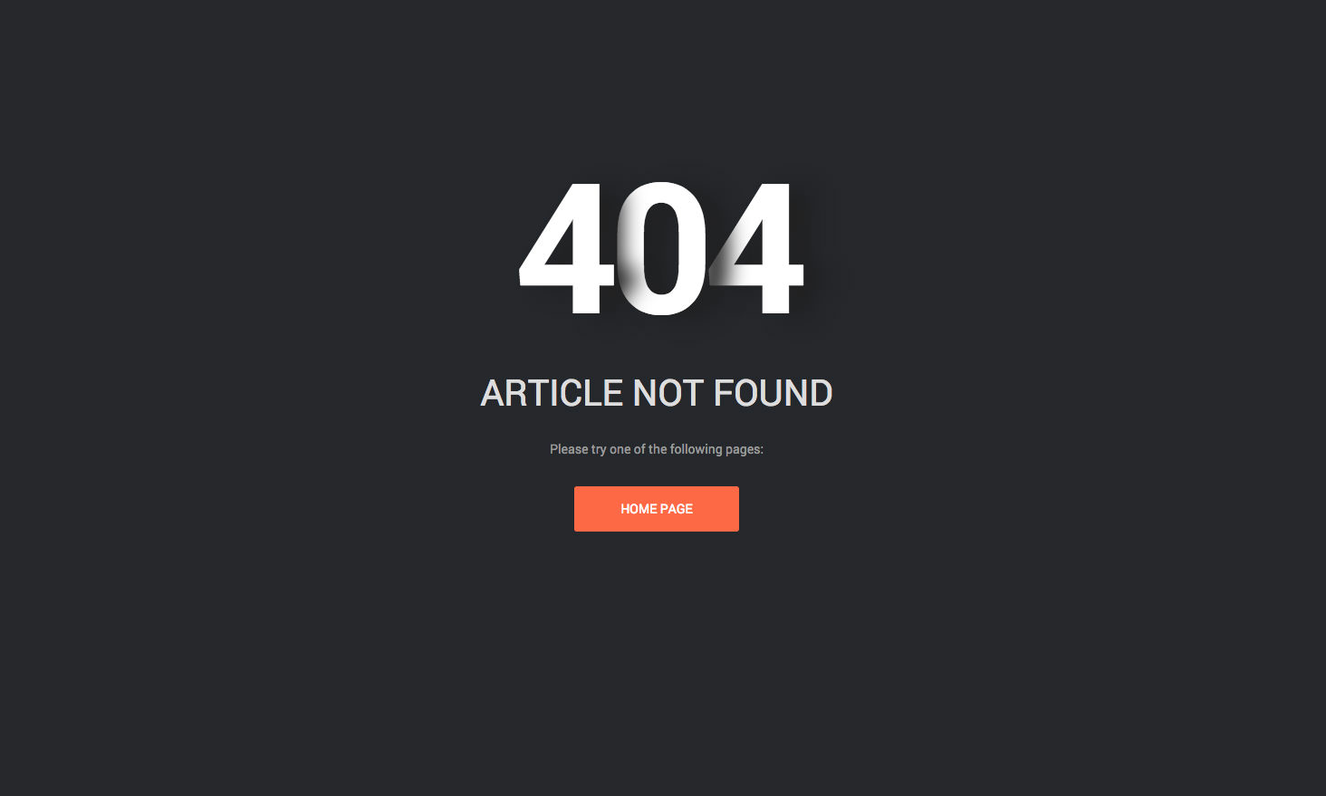
404 page
